Web Component

<img is="image-display-control">
An easy way to do Image Display Control in your HTML page.
If you are using React, you may want to have a look at the Image Display Control React component instead.
Overview
Without this web component
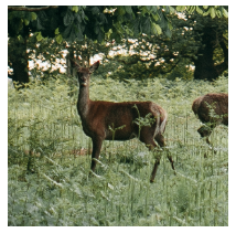
When an image is too big for its <img> HTML element, the best option browsers
offer nowadays is to use the
object-fit: cover;
CSS property in order to scale and middle-crop it:
<img
  src="https://images.pexels.com/photos/3625715/pexels-photo-3625715.jpeg"

  width="200"
  height="200"
  style="object-fit: cover;"
/>
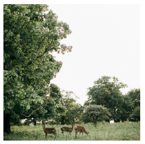
This is less than optimal, as there might be, in the example above, a better square-ish region in the image that could be displayed instead of the middle-crop.
Basic usage
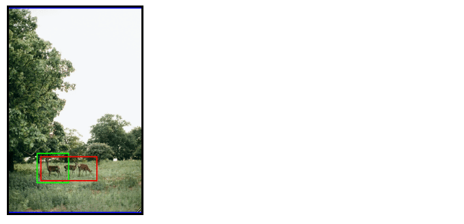
This web component extends the <img> tag with the ability to accept a list of
image regions, and to zoom in on the best one for the current element size:
<img
  is="image-display-control"
  src="https://images.pexels.com/photos/3625715/pexels-photo-3625715.jpeg"
  width="200"
  height="200"
  data-image-regions='[{
    "id": "oneanimal",
    "names": ["One animal"],
    "shape": "rectangle",
    "unit": "relative",
    "x": "0.217",
    "y": "0.708",
    "width": "0.239",
    "height": "0.1467"
  }, {
    "id": "threeanimals",
    "names": ["Three animals"],
    "shape": "rectangle",
    "unit": "relative",
    "x": "0.245",
    "y": "0.725",
    "width": "0.419",
    "height": "0.121"
  }]'
/>
The resulting HTML element is responsive and will automatically reassess the best region to zoom in on when it gets resized, e.g. when the user turns their phone from portrait to landscape.
Why a custom <img> element?
In order to have existing CSS rules in a project able to target indifferently
classic <img> elements and our web component, two options exist:
- Invent a custom
<img is="image-display-control" src="...">element implementing HTMLImageElement, or - Invent a custom
<image-display-control><img src="..."></image-display-control>element based on an HTML template with a<slot>element.
The problem with the second option is that it puts the <img> tag inside a new
parent element <image-display-control> and CSS rules such as
img {
  /* fill the parent element */
  width: 100%;
  height: 100%;
}
won't have the intended results, because the parent element hasn't been instructed to fill its own parent. This would force developers to adapt their CSS rules to also target the new parent, which is not ideal.
This is why we went with the first option, which doesn't require any CSS changes in existing projects.
Image Display Control metadata
Nowadays an image file (e.g. JPEG, PNG) can contain this type of image regions
in their metadata according to
the IPTC standard.
The back-end would typically be responsible for extracting them from the image
file and placing them in the front-end's <img data-image-regions=" attribute.
This is for example what
this WordPress plugin
does, with the help of a PHP library for extracting image metadata.
This can also be achieved on a Node.js back-end with the help of
this TypeScript library. In fact we have created
this React component
that does all this for you by serving the web component and running the
TypeScript library either on your Node.js back-end or in the browser.
Photographers, or anyone else, can use the Frameright webapp to define and store image regions in the metadata of their pictures.
Installation
Provided that you are using a bundler (e.g. Webpack or Rollup), you can add the web component to your project with:
npm install @frameright/image-display-control-web-component
Less than 20kB in your final client-side bundle.
or get it from a CDN:
<script
  type="module"
  src="https://cdn.jsdelivr.net/npm/@frameright/image-display-control-web-component@1.1.8/dist/image-display-control.min.js"
></script>
Usage
<html>
  <head></head>
  <body>
    <img
      is="image-display-control"
      src="https://images.pexels.com/photos/3625715/pexels-photo-3625715.jpeg"
      width="200"
      height="200"
      data-image-regions='[{
        "id": "oneanimal",
        "names": ["One animal"],
        "shape": "rectangle",
        "unit": "relative",
        "x": "0.217",
        "y": "0.708",
        "width": "0.239",
        "height": "0.1467"
      }, {
        "id": "threeanimals",
        "names": ["Three animals"],
        "shape": "rectangle",
        "unit": "relative",
        "x": "0.245",
        "y": "0.725",
        "width": "0.419",
        "height": "0.121"
      }]'
    />
    <!-- Built with Webpack or Rollup. Contains the web component: -->
    <script src="mybundle.js"></script>
  </body>
</html>
Dependency tree / credits
- ungap/custom-elements, a polyfill for web components on Safari. Many thanks to WebReflection!
Browser support
From scratch the web component should work on:
- Chrome 64+ (2018 or newer)
- Firefox 69+ (2019 or newer)
- Safari 15.4+ (2022 or newer)
More support can be achieved with a few tweaks: